

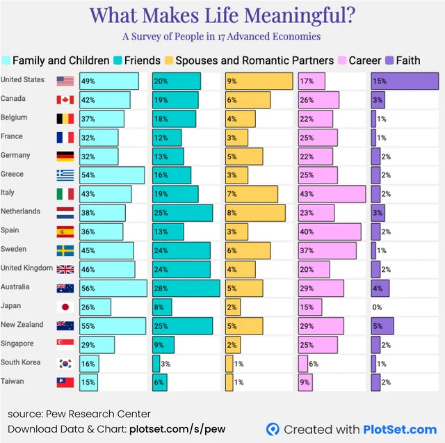
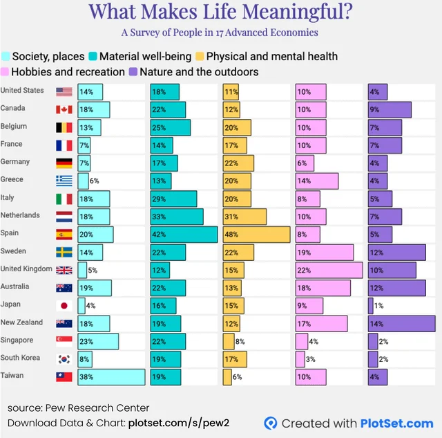
I browse reddit, and one 'sub' that I like is one where there are lots of charts, etc., called Data is Beautiful. It's interesting how different Japan's answers are than some other countries--note Aus/NZ, just above and below. Here are two of the charts:
In the post, there's one more chart at the end, that summarizes the answers a little:
In the post, there's one more chart at the end, that summarizes the answers a little:


