Graphic Design Assignment - Japanese Allergy Card

KippyK

Registered
Joined
9 Feb 2014
Messages
2
Reaction score
0
Hi Everyone!
I'm designing an allergy card for class. The idea is that a customer who has a gluten allergy can pass this card to the server or chef at a restaurant, helping them to avoid certain foods.
This card is specifically for avoiding Gluten (there are others I have to complete still), so as a rule of thumb, anything with wheat or flour in it.
I'd like some feedback on whether I've done the translation correctly, or how I can improve it.
I haven't attempted to do a direct translation from English to Japanese, I've just tried to make it simple to understand and get the information across.
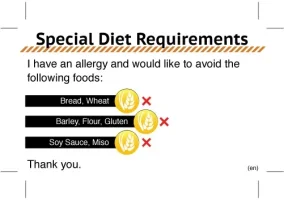
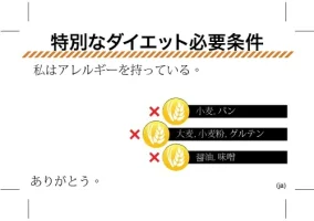
Japan-Translate-Card-Shorter-7---Sara-side-2.webp
Japan-Translate-Card-Shorter-7---Sara.webp
 
You have done close to a direct translation. You've written (more or less): I have ownership of an allergy.

Since your class isn't about Japanese, better not to use a language you don't know, or just write anything you like, since the content of something neither you or your teacher understands doesn't matter.
 
Thanks for the feedback.
I'd like to put the designs online for anyone to download and use for free. May as we'll make good use of my assignments :)
 
Is the download page going to be in Japanese for natives to look for easily?
 
What was your reason for doing this in English and Japanese? To my knowledge, food allergies aren't very common amongst the Japanese population, so this kind of product would be most useful for non-Japanese speaking foreigners eating out in Japan. Hence, you're best bet is to team up with a Japanese speaker or learner from your school, to ensure you're communicating effectively. Your target audience is both the people with allergies, and the people to whom they're trying to explain their dietary restrictions. Will your cards be bilingual?

As a design critique, I would ask you to ask yourself why you've made the cards look the way they do. At a glance, I saw bars and gold medals, and immediately thought of the Olympics; All three medals use the same color and icon; why is that? Why are the bars different lengths? Are you trying to communicate something through that, or was it just to prevent the medals from touching? To me, different length bars indicate progress, or in this context, maybe indicates your sensitivity to the ingredient? This probably isn't the case, but I'm trying to show how people may interpret your design. No decision is arbitrary--there should be a valid reason for everything you do. If you can logically explain why you made things one way or another, the end product will always benefit and become a stronger solution.

Have you done much research/analysis of similar projects? The cards Toritoribe-san linked to are great examples, take a look at them and try to analyze them with an objective eye: are they communicating effectively? Even if you don't understand the text, do you still understand the cards? What design elements did they employ to ensure effective communication? Where have they fallen short? What can be improved upon? I'm not saying you should copy them, but you should have the ability to break down the strengths and weaknesses of similar projects and incorporate that knowledge into your own work.

The first step to solving any design problem is understanding the problem.
 
Back
Top Bottom