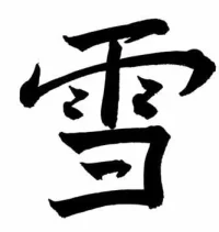
Calligraphy

How good / bad is this?

  • rotfwl!

    Votes: 1 5.3%
  • rubbish!

    Votes: 0 0.0%
  • nice try

    Votes: 12 63.2%
  • keep on practising

    Votes: 6 31.6%

  • Total voters
    19

sl0815

☆彡
Joined
31 Aug 2004
Messages
134
Reaction score
1
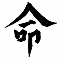
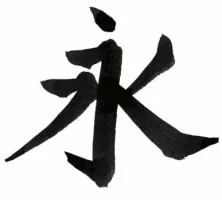
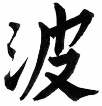
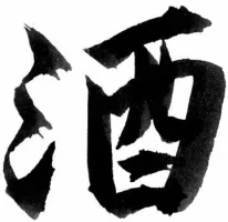
Basic question: How good / bad is this?
You don't have to be polite. Be rude or insult me but please be honest!
Cheers, Jan
 

Attachments

  • 1.webp
    1.webp
    5.4 KB · Views: 134
  • 2.webp
    2.webp
    7 KB · Views: 136
  • 3.webp
    3.webp
    9.7 KB · Views: 129
  • 4.webp
    4.webp
    12.3 KB · Views: 127
  • 5.webp
    5.webp
    7.1 KB · Views: 136
So lala. I can't really judge it, but my girlfriend says, that the width of the strokes is not in the right proportions. The last one ( 雪 ) should be the best,the upper part of it esp.
Overall actually pretty well for a European, she says.
 
That's pretty good! The standard 8 strokes for the word 永 is really nice.
Better than mine. I had to take 2 years of Calligraphy back in junior high and was never good at it. How long have you been learning calligrahpy?
 
I think you did very well. Calligraphy requires skills along with artistic talent.

They are better than how I ever did.
 
Thanks for all the replies! :-)

How long have you been learning calligrahpy?

Never learnd it. Just bought a small calligraphy set two years ago and started to imitate other people writings.

Hey, why did you pick those Kanji? Any special reason?

I like them.


Thanks a million,
Jan
 
I don't know anything about calligraphy but I can at least say that they look really nice. I'm a bit confused about the options you provided us on the poll though.
 
I don't know anything about calligraphy but I can at least say that they look really nice.

Wow! Thanks!

I'm a bit confused about the options you provided us on the poll though.

rotfwl - your writing sucks but gave me a good laugh
rubbish - your writing sucks
nice try - maybe you should look for another hobby
keep on practising - ... and you'll improve to a acceptable level in some years


Cheers, Jan
 
I'm taking a calligraphy class right now, and I have to say I'm kind of jealous. The overall balance and sizing of the characters is really excellent--you have the shapes down perfectly. That being said, I have to echo bossel's girlfriend and make a comment about your stroke widths: they are too uniform. The most interesting part of 書道 is the fact that no two people will write the same character the same way due to differences in their techniques and personalities. My uneducated suggestion, then, is that you are putting too much force into your strokes, possibly holding the brush too tightly. This is especially evident in 永 and 酒, as well as the top-right stroke of 命 (that line starts a little too thick, which is why you don't really have anywhere to go when you do the press-and-sweep at the end, which is actually very nicely done).

The good news, though, is that you seem to have really gotten the techniques needed to produce each variation of stroke down. The only thing you need to really work on is showing that fact off by varying the width of your lines a little more. 頑張れ!
 
Those are rather good for foreigner. However I find some words are written too thin while others too fat. Usually they should be about the same size.
I haven't wrote 漢字 for such a long time, the last time I practiced calligraphy was in primary school, ah memories, memories...
 
永 is the best! which probly means u could do all 8 types perfectly if u practiced just a little more!

がんばってね!
 
Back
Top Bottom