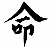
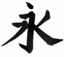
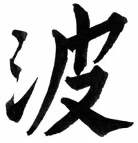
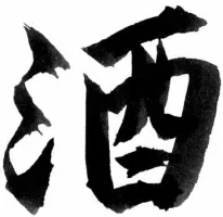
I'm taking a calligraphy class right now, and I have to say I'm kind of jealous. The overall balance and sizing of the characters is really excellent--you have the shapes down perfectly. That being said, I have to echo bossel's girlfriend and make a comment about your stroke widths: they are too uniform. The most interesting part of 書道 is the fact that no two people will write the same character the same way due to differences in their techniques and personalities. My uneducated suggestion, then, is that you are putting too much force into your strokes, possibly holding the brush too tightly. This is especially evident in 永 and 酒, as well as the top-right stroke of 命 (that line starts a little too thick, which is why you don't really have anywhere to go when you do the press-and-sweep at the end, which is actually very nicely done).
The good news, though, is that you seem to have really gotten the techniques needed to produce each variation of stroke down. The only thing you need to really work on is showing that fact off by varying the width of your lines a little more. 頑張れ!