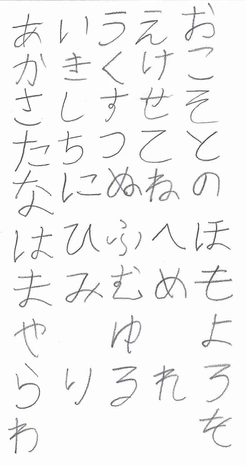
Let me provide some input on handwriting in general and yours in particular.
First i'd like to point out that those "hooks" appear naturally when one becomes confident with handwriting and begins writing fast. They are result of lateral movement being so fast that a tip of a pen (or any other writing utensil) is too late to separate from the paper to leave a "clean" stroke. In case of き and さ lateral movement is so fast - the tip of a pen flies the trajectory of the final stroke without actually touching paper in it's upper half. Notice how default fonts on PC lack any hooks: こ、け、さ、き
Looking at your handwriting it appears as if you tried to write the kana too carefully and diligently. Try writing them in a swift motion next time. Some tips on individual kana:
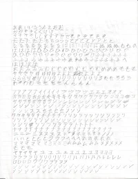
う - try writing the first stroke not horizontally but diagonally, almost vertically top-left to bottom-right. (example attached). Same tip goes for え by the way.
す - don't pull the tip of the last stroke up at the end. It should point anywhere in 180 - 270 degrees quadrant, 271 degrees and higher is no good.
そ - i found it hard for a handwritten そ to look neat in it's primary style, so i switched to an alternative style which involves two strokes instead of one. (example attached)
た - again, that "hook" is not meant to be there it appears naturally when you do handwriting in brisk pace and points from the end of the third stroke to the beginning of the fourth one. Yours is pointing in random direction.
と - try writing the first stroke straight down vertically. (example attached)
に - i hope that by this point you already got it. So i'll stop nagging about the hooks :emoji_wink:
ひ - aim for a thicker "sack". By thicker i mean - make it more plump, more of a circle rather than ellipse.
ふ is a tricky one. Luckily there are many variations of it's handwritten form for everyone to pick the one of their choice. I stopped at the one which is drawn in three strokes, with "side drops" written horizontally. (example attached) There is also a variant drawn in two strokes, and won't be surprised if i see one drawn in one stroke.
Don't start bending ナ's second stroke before it crosses the first one. Otherwise it can be mistaken for メ
Also i suggest getting hands on
A Reader of Handwritten Japanese (check your local Japan Foundation library for one) in order to have an idea what different people's handwriting may look like horizontally and vertically.
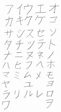
kana examples follow: