


- 14 Mar 2002
- 21,056
- 18,911
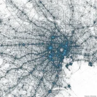
Though not an avid user of Twitter myself, I found the visualisations of the Visual Insights team quite interesting: they have released maps of urban areas based on the number of geotagged tweets since 2009. Each tweet is marked by a dark dot, areas of larger "tweet density" are indicated by bright patches. See their Tokyo map below.
Twitter is definitely an urban phenomenon which is quite obvious when you look at the North American map on their website.
Geotagged tweets have also been used to analyse the reaction of the tweet community to social or political events. Floatingsheep.org created a "Geography of Hate" map based on racist and degrading remarks following the 2012 presidential campaign of Barack Obama. Mississippi and Alabama topped the list in racist tweets.
While clearly not overly precise or representative, it illustrates social trends.
floatingsheep: FAQ: The Geography of Hate
Twitter is definitely an urban phenomenon which is quite obvious when you look at the North American map on their website.
Geotagged tweets have also been used to analyse the reaction of the tweet community to social or political events. Floatingsheep.org created a "Geography of Hate" map based on racist and degrading remarks following the 2012 presidential campaign of Barack Obama. Mississippi and Alabama topped the list in racist tweets.
While clearly not overly precise or representative, it illustrates social trends.
floatingsheep: FAQ: The Geography of Hate


